


Introduction
We are in the middle of an information overload about the novel Coronavirus, with hourly case updates and endless streams of information. Visualizations can be powerful tools for communicating this information, but can also mislead, misinform, and in the worst cases, incite panic. How can we best visualize Coronavirus data to get the best out of it? What information do you need to make decisions in the face of this pandemic?
This article features the top 10 tips that will help draw meaningful visualization of Coronavirus data.
1. What datasets can we derive from Coronavirus data?
Firstly, you will want to think of the datasets you can draw from the Coronavirus data you want to visualize. What are some of the common figures in Coronavirus datasets:
- New Cases; including the number of confirmed cases, for a given timeframe
- Cumulative Cases; Considering that these numbers over time only get larger and larger as new cases are added.
- Deaths; the number of confirmed deaths for a given timeframe – say, daily, weekly, monthly, e.t.c.
- Case fatality ratio; which is the number of deaths divided by the number of confirmed cases.
- Active Cases; Also described as prevalence, by some reporting entities.
2. How can you achieve accuracy of your data?
The accuracy of these numbers is dependent on a number of factors. Which are the reputable sources of data with well documented collection methodologies? Make sure that your visualization indicates the source of your data. Remember, the more credible the sources are, the more credible your visualization will be.
3. What do you consider when choosing the right visualization?
Choosing the right visualization can oftentimes be an overwhelming decision. You will find yourself with a lot of options to choose from. Firstly, knowing who your audience is will help you to determine what data you need. Knowing what story you want to tell – analyzing the data – tells you which data visualization type to use.
4. Relationship Types
The best way to narrow it down is to identify the relationship between the variables you want to highlight. What is the relationship between the variables you want to highlight? Some of the relationship types that you could use include;
- Change Over Time
- Comparison
- Distribution
- Part-to-Whole
- Geospatial
Let us now look how you would you visualize these relationships;
- Change Over Time
If you have time series data, a common relationship to visualize is change over time. Make sure to plot the timeline on the X axis. The following charts are options to illustrate trends over time.
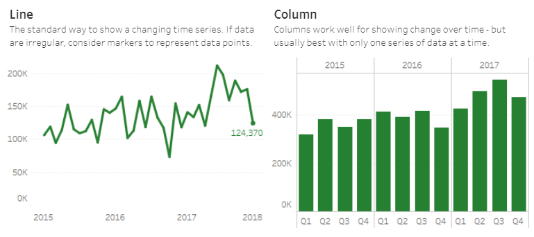
Source: Financial Times Visual Vocabulary
- Comparison
This visualisation method helps show the differences or similarities between values. See illustration below;

Source: Financial Times Visual Vocabulary
- Distribution
Distribution visualization is used to understand how data is distributed and how that compares to other datasets and distributions. These visualizations are often used to explore data as they show the values in the dataset and how often they occur. The shape of a distribution can be a memorable way of highlighting the lack of uniformity or equality in the data. See illustration below;
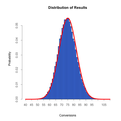
Source: Financial Times Visual Vocabulary
- Part-to-Whole
These charts are useful for showing how various parts of the data comprise the whole. While useful with a small number of categories they can quickly become difficult to read. If you are mainly interested in comparing the size of the parts, often a simple bar chart will be easier to read. Examples of Part-to-Whole include; Pie charts, Proportional Stacked Bar and the Donut Chart. See illustration below;

Source: Financial Times Visual Vocabulary
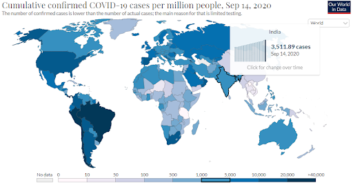
- Geospatial
Only use maps when precise locations or geographical patterns in data are a crucial part of your message. When the interesting patterns in your data are not geographic patterns, a map may end up distracting from your message. Just because it can be mapped, does not mean it must be mapped.

Source: Dashboard by the Center for Systems Science and Engineering (CSSE)
5. What are the design considerations you would make?
The way you would showcase Coronavirus pandemic data has the potential to shape your audience’s perception of risk and safety.
The design choices to make influence how your audience interprets your underlying data. This is because through design, you choose to emphasize certain aspects of the data while potentially obscuring others. While there are no hard and fast rules for making design choices, the following are a few considerations to think about when creating COVID-19 data visualizations;
- The color connotations of your visualization
- Use of linear and logarithmic scales
- Use of relative and absolute values
6. Color connotations of your visualization
What are the color connotations of your visualization? For example, Red is a color that grabs a reader’s attention and is often used to alert and highlight. A map full of overlapping red circles may communicate alarm and, as a result, may distract from other messages. Consider the connotation of the colors you intend to use when creating Coronavirus visualizations.
7. Use linear and logarithmic scales
The increase in the number of Coronavirus cases seems much more dramatic when it is displayed on a linear scale because the curve emphasizes the exponential and fast increase of the data. On the other hand, the logarithmic scale shows a straight line which has a much flatter slope. When these two scales display the same Coronavirus data, viewers will see two different results and may react differently to the data.
8. Relative and absolute values
When comparing Coronavirus data across countries or regions, you will want to consider how your visualization will change on the basis of your choice to use either absolute numbers or relative numbers. When taking into account Coronavirus data, absolute numbers represent the total number of confirmed cases while relative numbers represent the number of confirmed cases per X thousand people.
Source: European CDC – Situation Update Worldwide
9. How would you visualize Coronavirus uncertainty?
It is a fact that there is still a great deal of uncertainty around Coronavirus data, and this is present in the data. You will want to try to find ways to show this uncertainty in the visualisation of your choice. For instance, you could choose to add a simple phrase ‘we know of X cases’ to help pass a critical message that the data displayed is not complete.
10. Clarity of your visualization
Finally, remember that a cluttered graph, map or scale will not communicate any information. Keep in mind that data and its meaning comes before aesthetics and user experience. A visualization that is not clear will just confuse the viewers.
Summary
There have been the emergence of many Coronavirus data visualizations. Some of these have flaws that make readers have a difficult time drawing meaning from them. Many have improved since the onset of the ongoing Coronavirus pandemic. The tips discussed in this article will help someone create a good, reliable visualization that displays real time, coronavirus data.